We were interested in a topic that's closely related to us, so we
adopted the data set "College tuition, diversity, and pay" from
Kaggle. This dataset is pretty clean and comes in 5 separate CSV
files, and we think it would be easy to do for our mini project 2. As
we were discussing the focus of our visualization, we reached the
consensus that we are really interested in a couple of aspects:
tuition cost, salary after graduation (i.e. early career), salary in
mid career, and the impact of school rankings and geographical
locations. Next, we put our focus in making the visualizations of our
selected topics. Hope you find it interesting!
Here are some notes from the source website:
"Historical averages from the National Center for Education Statistics
(NCES) - spanning the years 1985 - 2016. Tuition and fees by
college/university for 2018-2019, along with school type, degree
length, state, in-state vs out-of-state from the Chronicle of Higher
Education. Diversity by college/university for 2014, along with school
type, degree length, state, in-state vs out-of-state from the
Chronicle of Higher Education. Example diversity graphics from
Priceonomics. Average net cost by income bracket from
TuitionTracker.org. Example price trend and graduation rates from
TuitionTracker.org Salary potential data comes from payscale.com."
QUESTIONS
Tuition
What is the average cost of college tuition?
How does the cost of tuition change over time?
Are higher ranking schools more expensive?
Pay
What are students expected to make after graduation?
Are tuitions and salaries related to geographic locations?
Do graduates from higher ranking schools make more in early and mid careers?
Click here to access the data source
VISUALIZATION

EXPLANATION

We start by looking at the average costs of tuition. We parallelled four charts (average in/out state tuition and average in/out total cost which includes boarding etc.), each containing three bar charts: public, private, and others. It is evident from the bar chart that tuition in private schools is much higher than those of public. The average total tuition for private schools is around 39k, while the average total public school tuition is around 14k.

How does the cost of college change over time? From 1985 to 2016 (the span of our dataset), we see that tuition costs were steadily increasing. It is worth noting that public and private institutions experienced similar growth rate. For example, the cost of public school had nearly tripled up, while that of private had nearly tripled up as well. Nevertheless, since private schools are more expensive in the first place, being at similar growth rate means private schools are getting more and more expensive and making more and more people broke.
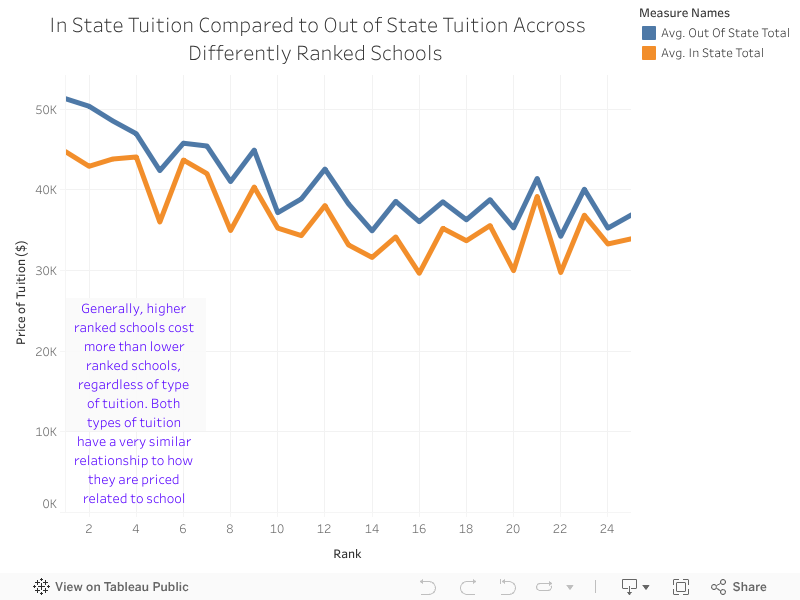
Ranking is important when deciding which college to go to, but it is also important to compare the costs. We picked the average tuition cost data for top 25 ranking schools and found the following trends. By looking at the graph, we see that generally the higher ranking schools are more expensive. There are three caveats, however: 1. the tuition can fluctuate quite frequently (see the fluctuations from one school to nearby schools). 2. college rankings can change 3. we did not include more data for other schools such as top 50 or 100 colleges.

Do graduates from higher ranking schools make more in early and mid careers? The answer is yes. Our trend line shows that as the ranking of a school increases, so do the expected early and mid career salaries. To emphasize the cost of tuitions, we put the cost of attending these schools in blue and orange lines. Together, we can get some nice conclusions: 1. higher ranking does pay off. 2. but we need to pay more to attend higher ranking schools. Whether it's worth it or not comes back to individual's decision.

Now we look at the relation between geographical location and tuition cost. We originally predicted that more expensive states have more expensive schools. Our prediction is confirmed by the map, but a couple of states caught our eyes. In Alaska, the cost of public school is relatively higher than other US states, whereas private schools are cheaper than private schools in other states. What's more, we found that expensive private schools are generally located in either east or west coast, while expensive public schools are still located in the east coast.

When we look at salary after graduation, which is another topic we are intersted in, we found that in economically robust area (such as California, New York, and Massachussets), the pay will be higher. In the previous analysis, we also saw that the cost of attending schools in those areas are higher. One implication we draw is that for a high schooler who wants to make the most out of his career, it is advisable to go to school in those areas, but he needs to face a more expensive reality in terms of college tuition.